FOWLER DISPATCHING
Fowler Dispatching is no longer an active business. This site is a design prototype created from a university project and is not intended for actual business use. It is a demo site showcasing design concepts and is not affiliated with any real-world dispatching service.
Fowler Dispatching was originally a small dispatching service founded and operated by one of my friends, based in Racine, Wisconsin. The business focused on coordinating freight and logistics for clients, providing personalized support in a competitive industry. While the company is no longer active, this project allowed me to explore redesigning the site to create a more modern, professional, and user-friendly experience, while reflecting the real-world context of a small dispatching operation.
ABOUT THIS PROJECT
This project was originally just a mockup created for my Web Design 201 - Interaction Design course during my Fall 2022 semester at UWSP. It was my final project for the course, where I chose to redesign a friend’s dispatching site.
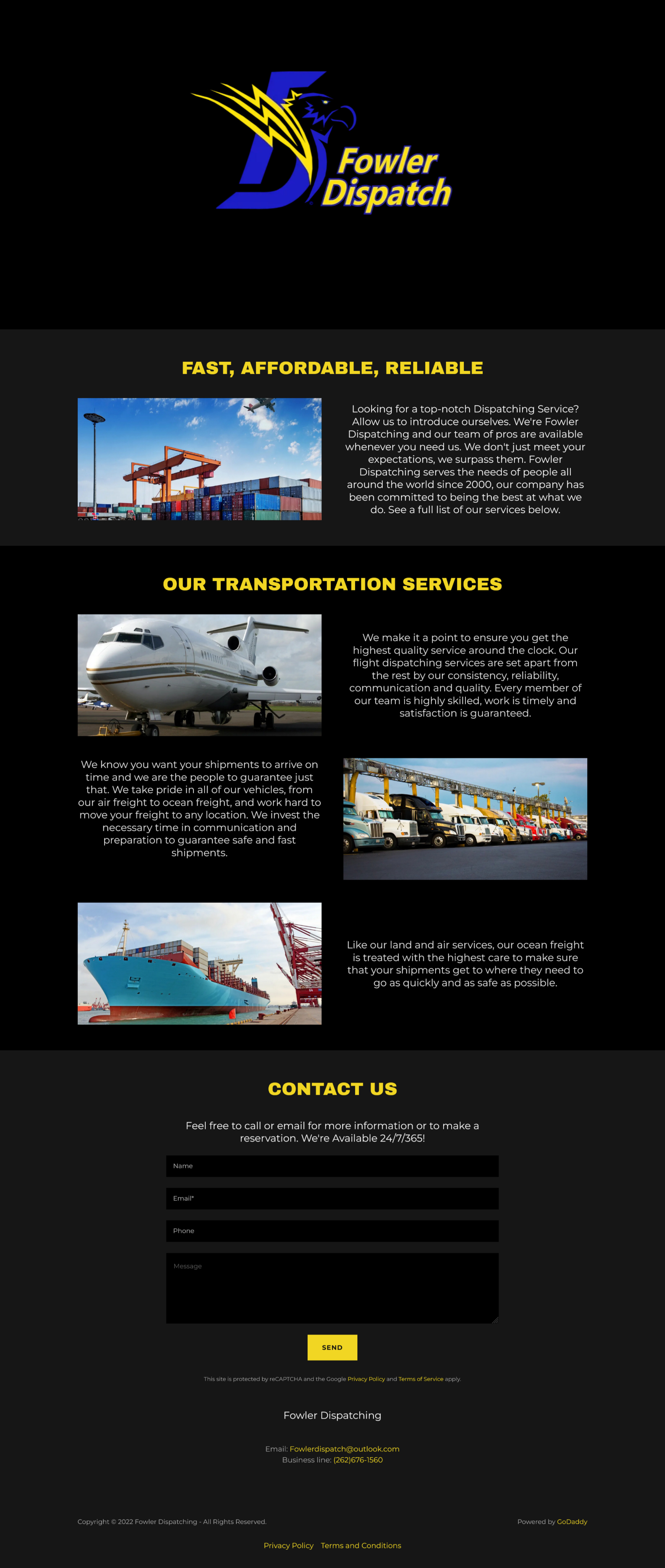
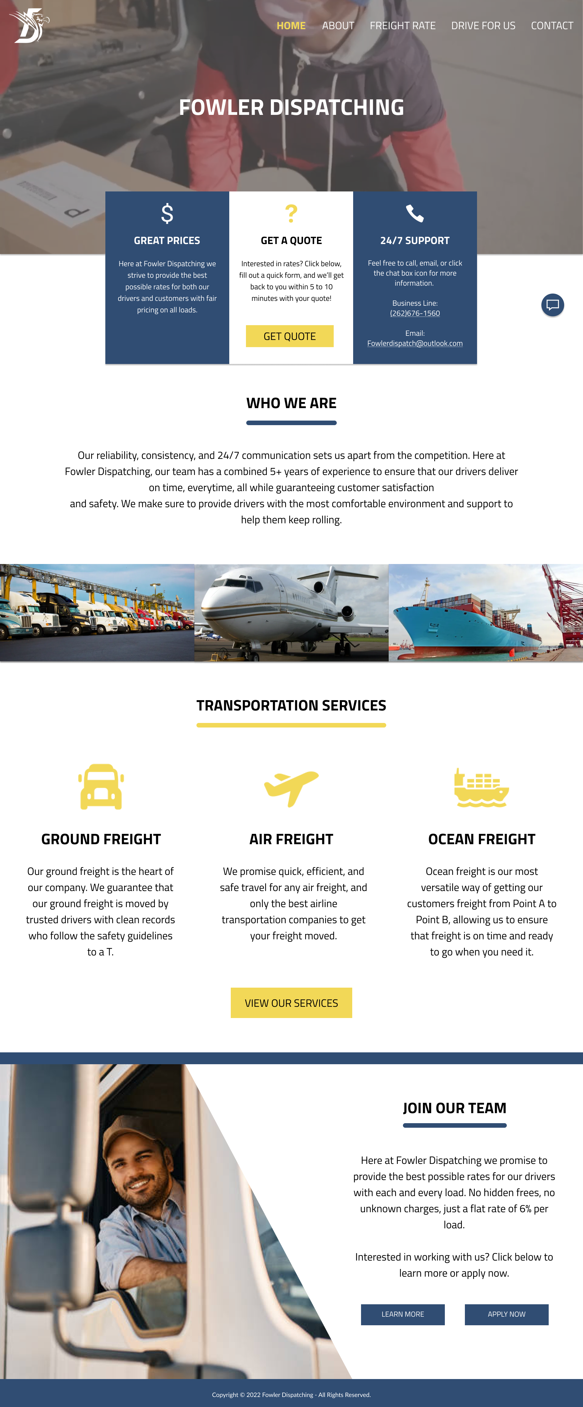
The original website felt somewhat unpolished, with a darker, less inviting design. There was a noticeable lack of human presence in the imagery, and the information felt sparse, making the site feel less approachable. My goal was to create a more welcoming and user-friendly experience while providing clearer information.
Recently, I revisited this project as a quick exercise to practice working with Bootstrap and to refine the layout and responsiveness of the design.
ORIGINAL

REDESIGN

Mockup vs. Current Design
When translating the design from the original Figma prototype into Bootstrap, several adjustments were made to better align the site with typical dispatching websites (and also because Bootstrap made it easier to make these edits).
The most notable change was the replacement of the original yellow accent with a darker gray tone. This choice was intentional as the gray conveys a more serious, professional, and “tough” aesthetic, which felt more appropriate for the dispatching industry.
Additionally, all pages for the site have been created for this redesign while the original project only required two fully designed pages. These new pages helped create a more complete and cohesive user experience, while maintaining the overall visual identity and improving usability.
Overall, the redesign balances the original mockup’s intent with practical improvements to readability, visual hierarchy, and the user’s sense of trust in the website.